Most warehouse mapping protocols include a line saying the study will capture seasonal extremes. Very few say which months those are, or why.
That isn't really the author's fault. The guidance asks for seasonal extremes without ever defining them, and the question an auditor asks next, “why did you map in those months?”, is one of the most common I hear. So a few years ago I went looking for a defensible answer in weather data, and for this article I've gone back to the question with freely available climate data from the World Bank and NASA. This article covers why it matters, what the guidance does and doesn't say, and what the data suggests.
Why temperature gets this much attention
Temperature is a critical process parameter in storage and distribution. That means it's a parameter whose variation affects a critical quality attribute of the product, so it has to be controlled and monitored. Too much heat for too long accelerates degradation, and some products, vaccines in particular, are damaged by exposure to cold. The damage is often invisible, which is why the storage conditions have to be proven rather than assumed. Cumulative heat exposure is usually expressed as mean kinetic temperature, and our free MKT calculator shows how quickly short excursions add up.
WHO describes qualification as an inspection and testing process that establishes equipment or an installation is fit for purpose in the operational context within which it will be used (Supplement 7). That last phrase is the one that matters here. A warehouse doesn't operate in an average month. It operates through a South African summer and a highveld winter, and the mapping has to show it copes with both.
Four reasons to map
Mapping is often treated as a box to tick at handover. It does four distinct jobs, and it's worth being clear which ones your study is designed to do.
- To demonstrate uniformity. The study shows that the temperature variation that does occur across the space stays within the defined acceptance criteria. SAHPRA's wholesaling guideline puts it simply: temperature mapping should show uniformity of temperature across the storage facility.
- To define zones not to use. Mapping identifies locations that present a risk under normal operation, such as areas close to cooling coils, cold air streams or heat sources (Annex 9, clause 4.7). SAHPRA gives the airflow from a refrigeration unit as an example of a place product shouldn't be stored (SAHPGL-INSP-03, section 3.10.5.9).
- To quantify the time to an excursion. How long does the space hold temperature after a power failure, or recover after a door opening? Those numbers should shape your standard operating procedures and the instructions warehouse staff actually follow.
- To decide where the monitoring probes go. This is the one I'd put first. Mapping shows where the warm and cold extremes are, and that's where continuous monitoring belongs. One cannot control what one cannot monitor. WHO lists identifying the best monitoring sensor locations among the objectives of a mapping study (Supplement 8), and SAHPRA expects monitoring at the points representing the temperature extremes, based on temperature mapping (section 3.10.4.2).
The phrase nobody defines
Here's what the main references ask for on seasons.
SAHPRA's current guideline says all warehouses should be temperature mapped over a period of at least one year to determine the temperature distribution under seasonal extremes, and that mapping should be repeated every two to three years (SAHPGL-INSP-03 v5, sections 3.10.3.3 and 3.10.3.4). WHO says that where a storage area is affected by seasonal variation, at least two studies may be needed, one in the warmest season and one in the coldest (Supplement 8). USP <1079.4> asks for seasonal variation to be part of an organisation's mapping rationale.
None of them says which months count, or what temperature makes a month an extreme. Traditional seasons don't help much either. The astronomical and meteorological definitions divide the year on the basis of solstices and equinoxes, not on the temperatures a building actually experiences, and they don't account for local climate at all.
What freely available climate data suggests
I've used two open data sets for this. The World Bank's Climate Change Knowledge Portal publishes monthly temperatures for South Africa as a whole from 1950 to 2025. NASA's POWER project publishes daily maximum and minimum temperatures for any point on the map, and I took 1991 to early September 2026 for eight locations on the main distribution routes: Johannesburg, Pretoria, Polokwane, Bloemfontein, Upington, Durban, Gqeberha and Cape Town. Both are modelled estimates for a grid square rather than readings from a single weather station, which I come back to below. If you want station records for a specific site, the South African Weather Service is the national source.
The baseline is moving
Before getting to months, it's worth knowing that “a normal summer” isn't a fixed thing. Against the 1991 to 2020 average, the years 1950 to 1979 ran about 0.7 °C cooler, and 2010 to 2025 has run about 0.35 °C warmer. Since 1991 the national trend works out at roughly 0.3 °C a decade, and the five warmest years in the record have all come since 2015.
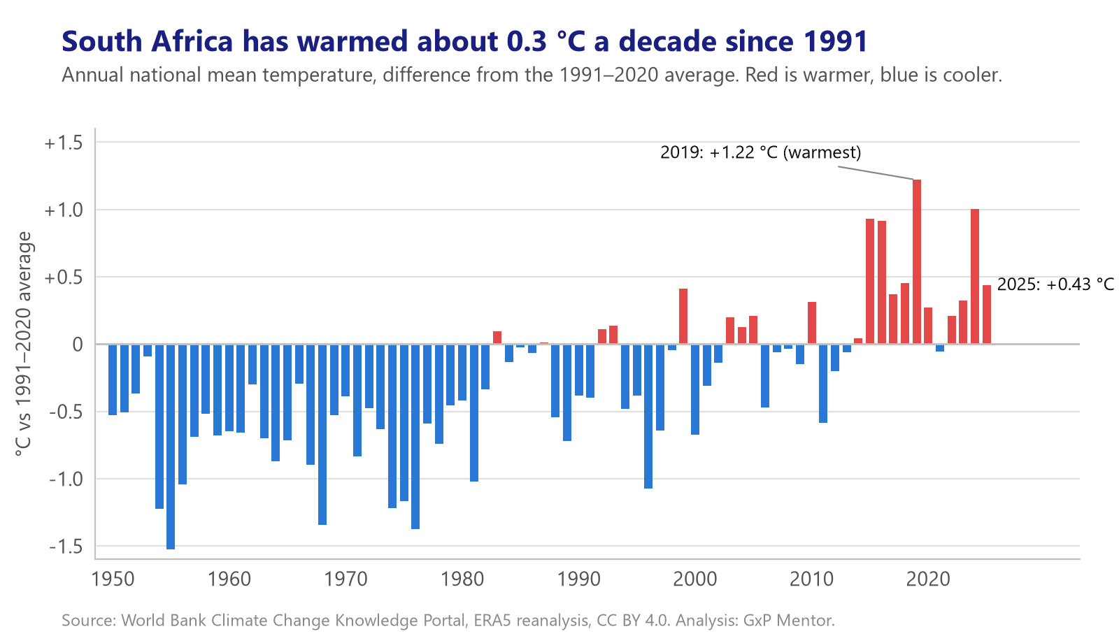
For mapping, the practical point is simple. A seasonal rationale built on an older data set describes a slightly cooler country than the one your warehouse sits in today.
Interrogating the obvious method
The simplest approach, taking the hottest and coldest month by average temperature, gives the answer you'd expect. On the World Bank's national figures, January is the warmest month and July the coolest. But that leaves a one-month window each year for a seasonal study, which isn't workable for anyone planning a seven-day mapping around real operations.
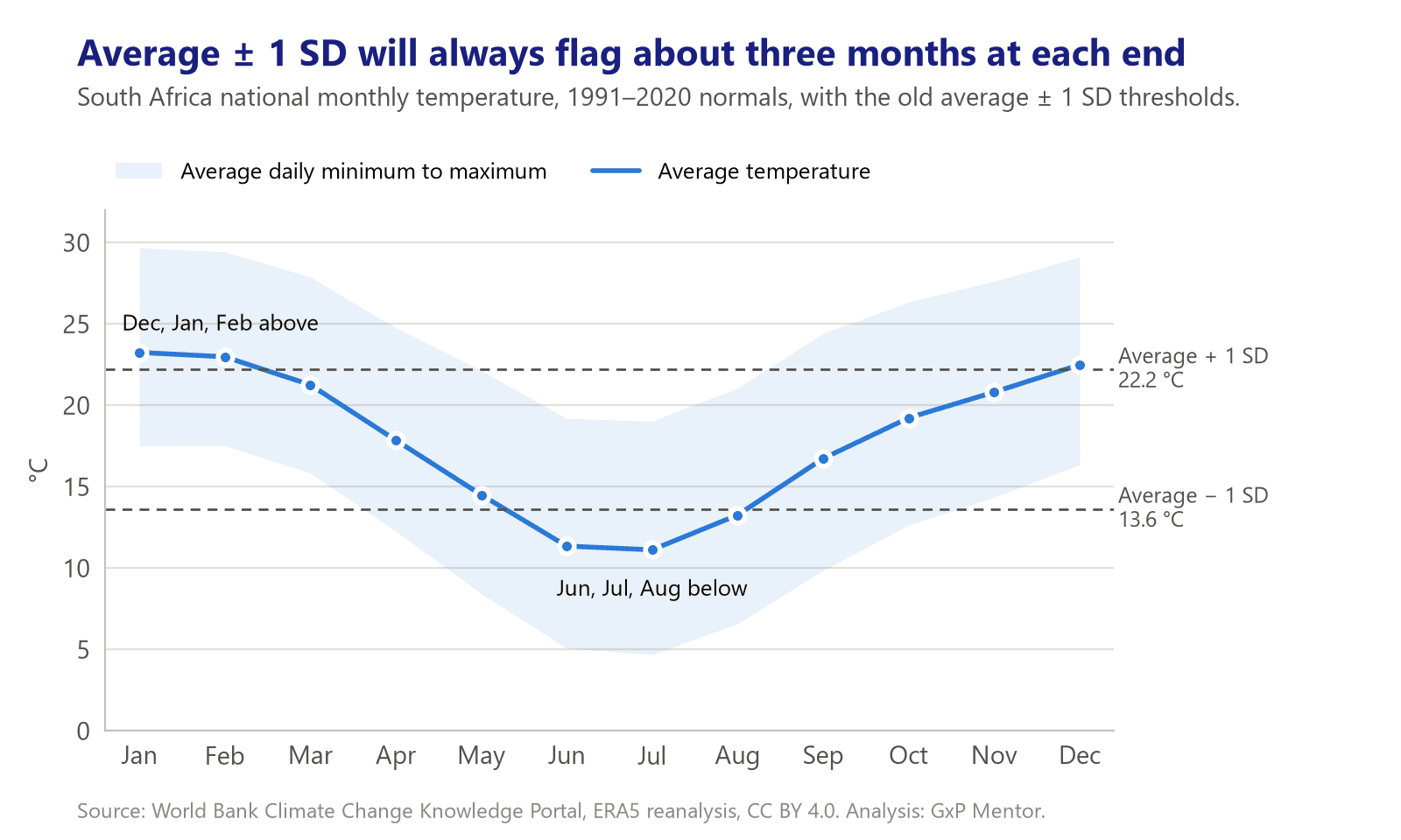
The next step I originally took was to compare each month's average temperature against the overall annual average, plus or minus one standard deviation. On the national 1991 to 2020 figures that's 17.9 °C plus or minus 4.3 °C. Months above 22.2 °C count as summer extremes, months below 13.6 °C as winter extremes, and it picks out December, January and February, and June, July and August.
That looks like a finding, but when I went back to it I realised most of it is built into the arithmetic. Temperature through the year follows a fairly smooth wave, and for a smooth wave one standard deviation always sits about 70% of the way from the average to the peak. So roughly three months will land beyond it at each end, whatever the country or climate. The method doesn't really find the extremes, it confirms the year has a warm end and a cold end. It also works on monthly averages, which smooth away exactly the hot afternoons and cold nights a building has to cope with, and it treats the whole country as one site.
A better question: will a seven-day study catch the extremes?
A mapping study doesn't run for a month. It runs for seven days or so. So the more useful question is this: if I start a seven-day study on a given date, how likely is it to include genuinely extreme conditions for that location?
To answer it, I took the hottest 10% of days (by daily maximum) and the coldest 10% of nights (by daily minimum) for each location, using 1991 to 2020 as the reference period. Then I checked every possible seven-day window from 1991 to 2025 and counted a window as a success if it contained at least three of those days. Grouping the start dates into half-months gives the chance that a study started then catches a real extreme.
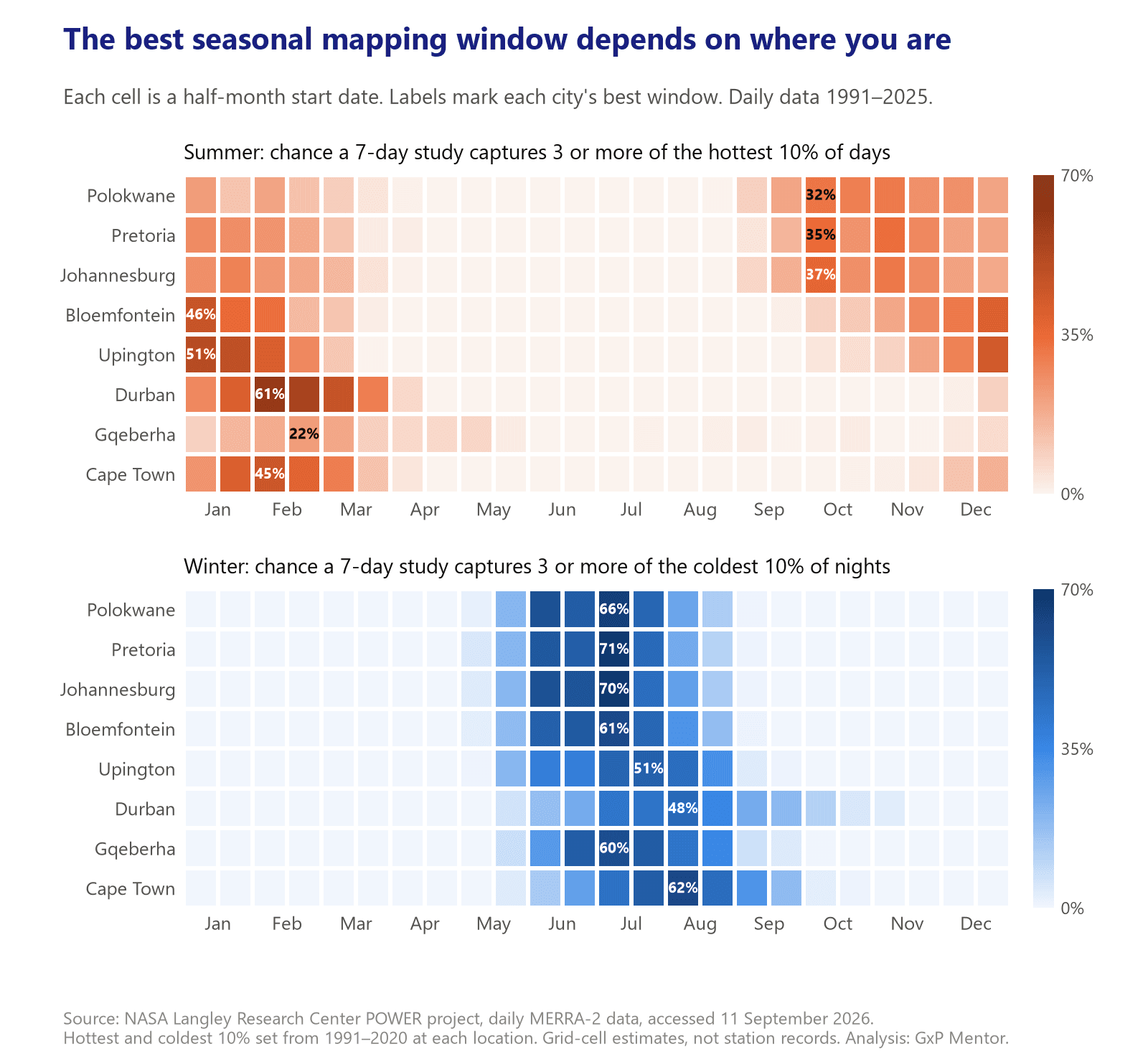
Winter is the forgiving one. Inland, the first half of July gives a 61% to 71% chance in Johannesburg, Pretoria, Polokwane and Bloemfontein, and Gqeberha peaks at the same time. Upington peaks a little later, in the second half of July. Cape Town and Durban are later still, with their best windows in the first half of August.
Summer is where a national calendar can lead you astray.
- Gauteng and Limpopo. The hottest spells come early. The first half of October is the single best start date in Johannesburg (37%), Pretoria (35%) and Polokwane (32%), with November close behind, which fits the familiar highveld pattern of hot, dry weeks before the summer rains settle in. A study started in February has between a 13% and 24% chance there.
- Free State and Northern Cape. December to January, with the first half of January best in Upington (51%) and Bloemfontein (46%).
- Durban and Cape Town. Later again, with the first half of February best (61% and 45%).
- Gqeberha. No reliable heat window. The best start date only reaches about 22%, and hot days are spread thinly across a long season, so no single week is a safe bet.
Averaged across all eight locations, summer peaks in late January to early February and winter in early July, which is close to what the national monthly figures say. The point is that very few sites experience the average.
| Region (locations analysed) | Summer study | Winter study |
|---|---|---|
| Gauteng and Limpopo (Johannesburg, Pretoria, Polokwane) | October to November | June to July, best in the first half of July |
| Free State and Northern Cape (Bloemfontein, Upington) | December to January, best in the first half of January | June to early August, best in July |
| KwaZulu-Natal coast (Durban) | Late January to early March, best in the first half of February | July to mid-August, best in the first half of August |
| Western Cape (Cape Town) | Late January to February, best in the first half of February | Late July to August, best in the first half of August |
| Eastern Cape coast (Gqeberha) | No reliable window. Record ambient conditions and extend the study if needed | Mid-June to July, best in the first half of July |
Table 1: Indicative seven-day mapping windows by region, based on one to three locations per region. NASA POWER daily data, 1991 to 2025.
Show the numbers behind Figure 3
| Location | Best summer start | Chance | Best winter start | Chance |
|---|---|---|---|---|
| Johannesburg | 1 to 15 October | 37% | 1 to 15 July | 70% |
| Pretoria | 1 to 15 October | 35% | 1 to 15 July | 71% |
| Polokwane | 1 to 15 October | 32% | 1 to 15 July | 66% |
| Bloemfontein | 1 to 15 January | 46% | 1 to 15 July | 61% |
| Upington | 1 to 15 January | 51% | 16 to 31 July | 51% |
| Durban | 1 to 15 February | 61% | 1 to 15 August | 48% |
| Gqeberha | 16 to 28 February | 22% | 1 to 15 July | 60% |
| Cape Town | 1 to 15 February | 45% | 1 to 15 August | 62% |
Chance that a seven-day study started in that half-month includes three or more of the location's hottest 10% of days (summer) or coldest 10% of nights (winter), 1991 to 2025.
One more pattern is worth watching, though not acting on yet. Comparing 1991 to 2005 with 2011 to 2025, the average chance of catching a heat spell between October and December has gone up across the eight locations, and February's has come down. Winter's best window has also drifted a little later, from late June towards late July and August. Fifteen years a side is too short to call that a trend, and I wouldn't change a protocol on it alone. But it's a good reason to revisit a seasonal rationale that was written a decade ago.
There's independent support for the regional picture. A peer-reviewed statistical classification of South African seasons, using daily temperature data from 35 weather stations between 1980 and 2015, placed summer from October to March and winter from June to August (van der Walt and Fitchett, 2020). Those are the season boundaries, so they're wider than the extremes, but the extremes sit squarely inside them. The same study found that summers start later and winters end later in the southwest of the country than in the northeast, which lines up with the later windows for Cape Town above, and is a good reminder that a national average isn't your site.
Limitations, and how I'd use this
These results are an indication, not a rule, and there are a few things to keep in mind.
- They're grid estimates, not station readings. Each value represents a grid square tens of kilometres across. That smooths out local effects like altitude, urban heat and sea breezes, and coastal squares include some sea, which makes their temperatures milder than a thermometer in town would show. That's why I've reported timing rather than temperatures.
- It's outdoor air, not the inside of your building. Roof construction, insulation, orientation and the cooling system all change how, and how quickly, outdoor conditions show up inside.
- Eight locations isn't the whole country. Some regions rest on a single location.
- “Extreme” is relative to each location. A hot day in Cape Town is a mild one in Upington. That suits the question, because each building is designed for its own climate, but the percentages compare timing, not severity.
- The thresholds are judgement calls. I tested two, three and four extreme days in seven. The percentages change, but each location's best window moves by a month at most and stays within the regional windows in Table 1.
- History isn't a forecast. El Niño and La Niña years, and one-off heat waves or cold fronts, can move any given year.
With that in mind, here's how I'd apply it:
- Start with your region, not the national calendar. Use Table 1 as a starting point for when to schedule warehouse summer and winter studies.
- On the highveld, don't assume February is your summer extreme. October and November give noticeably better odds of catching real heat.
- Avoid April for any study that's meant to represent a seasonal extreme. No location showed a useful window for either season.
- Check the forecast in the fortnight before and move the start date if you can. A forecast heat wave or cold front beats any historical probability.
- Look at data for your own site where you can. NASA POWER gives free daily data for any coordinates, and the South African Weather Service holds station records.
- Record ambient temperature during the study, and judge the result against the conditions you actually achieved, not the month on the calendar. A cool week in January isn't a summer study.
- Write the rationale into the protocol. When the auditor asks why you mapped in those months, the answer should already be in the document.
Cold rooms are a slightly different case. WHO says two-season mapping typically isn't necessary for cold rooms and freezer rooms, but the SAPC requires annual mapping of thermolabile storage areas under normal use, and seasonal ambient conditions can still affect how refrigeration equipment performs. Where the timing is flexible, there's a reasonable case for doing that annual study inside a seasonal extreme.
For the durations and frequencies the guidelines set, see No Action Required, and for how the building itself shapes the result, see Design It Like You'll Have to Map It. Our approach to studies is on the thermal mapping page.
This article is written in a personal capacity. The seasonal analysis is the author's own, using the open data sets below. It is indicative and has not been peer reviewed.
Data: World Bank Group, Climate Change Knowledge Portal, ERA5 0.25° monthly mean, maximum and minimum temperature for South Africa, 1950 to 2025, licensed under CC BY 4.0 (climateknowledgeportal.worldbank.org). The data was obtained from the National Aeronautics and Space Administration (NASA) Langley Research Center's Prediction Of Worldwide Energy Resources (POWER) project funded through the NASA Earth Science Division. NASA POWER Daily API v2.9.7, MERRA-2 daily maximum and minimum 2 m air temperature for city-centre coordinates, 1 January 1991 to 5 September 2026, accessed 11 September 2026 (power.larc.nasa.gov).
References: WHO Technical Report Series No. 961 (2011), Annex 9, and its technical supplements published as WHO Technical Report Series No. 992 (2015), Annex 5, Supplement 7, Qualification of temperature-controlled storage areas, and Supplement 8, Temperature mapping of storage areas. SAHPRA SAHPGL-INSP-03 v5, Guideline on South African Good Wholesaling Practice for Wholesalers (18 September 2022). SAPC Good Pharmacy Practice in South Africa, Part 2, Rules relating to good pharmacy practice (Board Notice 129 of 2004, as amended), Rule 2.3.5.3(c), incorporating the Board Notice 50 of 2015 amendments. USP General Chapter <1079.4>, Temperature Mapping for the Qualification of Storage Areas.
Van der Walt AJ, Fitchett JM. Statistical classification of South African seasonal divisions on the basis of daily temperature data. S Afr J Sci. 2020;116(9/10), Art. #7614. doi.org/10.17159/sajs.2020/7614
Readers should always work from the current published text rather than a summary of it.